Dezignza case study · QR ordering platform · 2026

Skip the wait.Order in 20 seconds.
No app. No account. No queue. Scan the code on the cart, pick, pay at the counter and wait for your number. We designed and built every bit of it: the brand, the order flow, the staff board, the owner admin and the plugins.
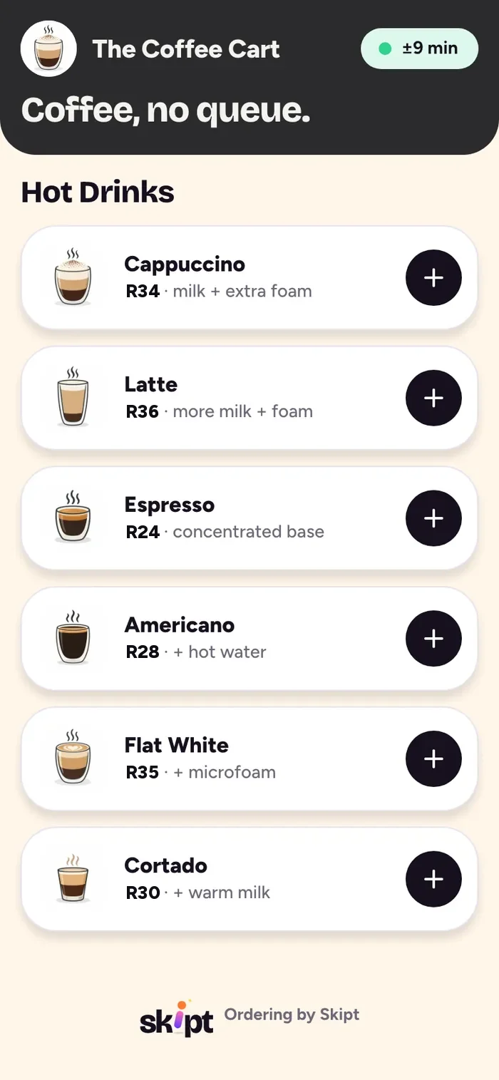
01 · MenuEverything on one screen 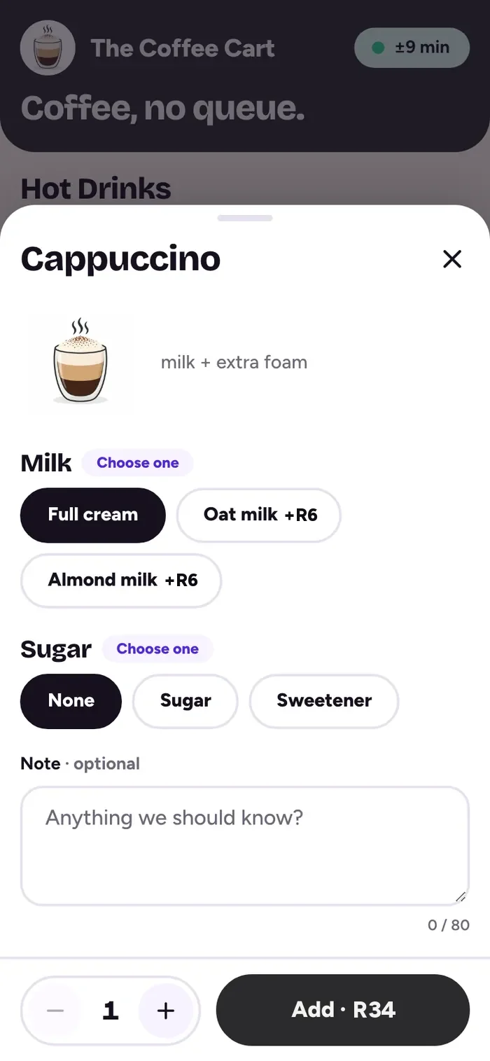
02 · CustomiseDefaults already picked 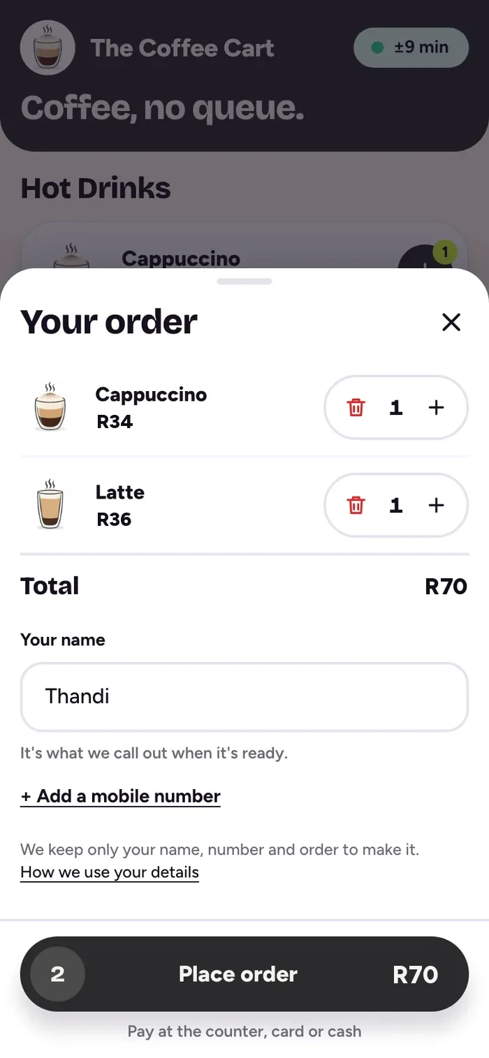
03 · CartName and order, one sheet Thanks, Thandi!
Your number#24MakingSentMakingReadyDone
About 4 minutes2 orders ahead. We’ll call your name.Pay at the counterCard or cash · R7004 · Your numberLive status, no refresh READY!
Your number#24Come grab it, Thandi.
Pay at the counterShow your number. That’s it.05 · Ready!A buzz, a sound, a big word 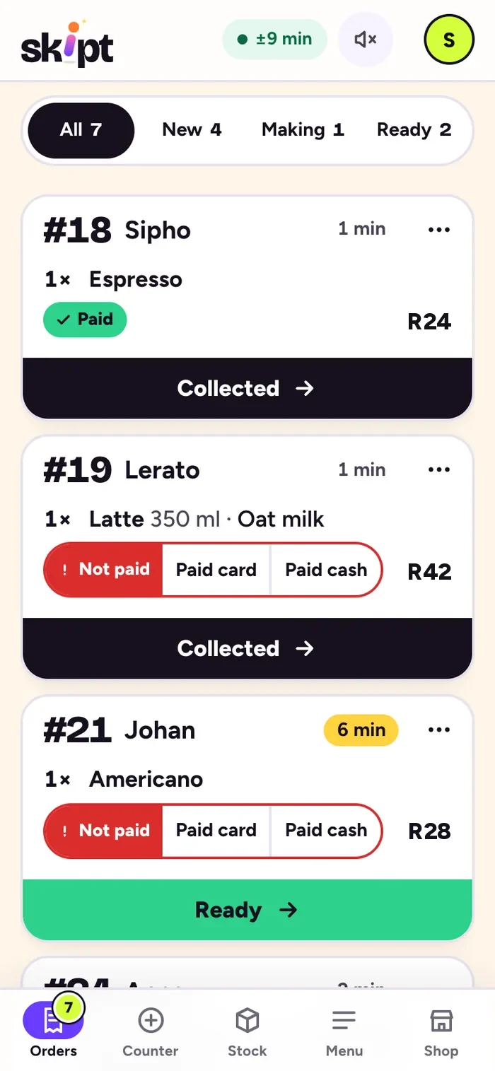
06 · The boardStaff see it land
- WhatMulti-tenant ordering platform, web and installable app
- ForCustomers, baristas, stall owners
- PilotA coffee stall in Stellenbosch, live on skipt.co.za
- Dezignza didBrand, product design, full build, launch
10 people.
1 counter.
2 hands.
Orders shouted over the grinder. The person steaming the milk is also taking the next order.
Names on a paper cup. Who had the oat latte? Every wrong cup is a remake.
Paying holds up the line. Card, cash and change at the front while the queue walks off.
Order from the queue, not at the front of it.
Skipt moves ordering onto the customer’s own phone. The counter is left for what only the counter can do: making the drink, taking payment and handing it over. Every feature had to work for the first stall without ever hard-coding it, so the same platform runs any cart, truck or market stand.
Go on. Time yourself.
This is the order flow in miniature. Add a drink or two, then place the order. The clock starts on your first tap.
The target is under 20.
Thanks, Thandi!
SentMakingReadyDone
Seven steps became four taps.
After the first round of feedback a coffee still took five taps, a scroll and a checkout page that listed the whole cart again. We folded checkout into the cart sheet and cut every screen with nothing to choose.
- Before
- Drink
- Add
- View cart
- Checkout
- Scroll
- Type name
- Place order
- After
- 1 Drink
- 2 Add
- 3 View cart
- Name, in the cart
- 4 Place order
Tap a drink. No category step.
Add. The price updates as you pick.
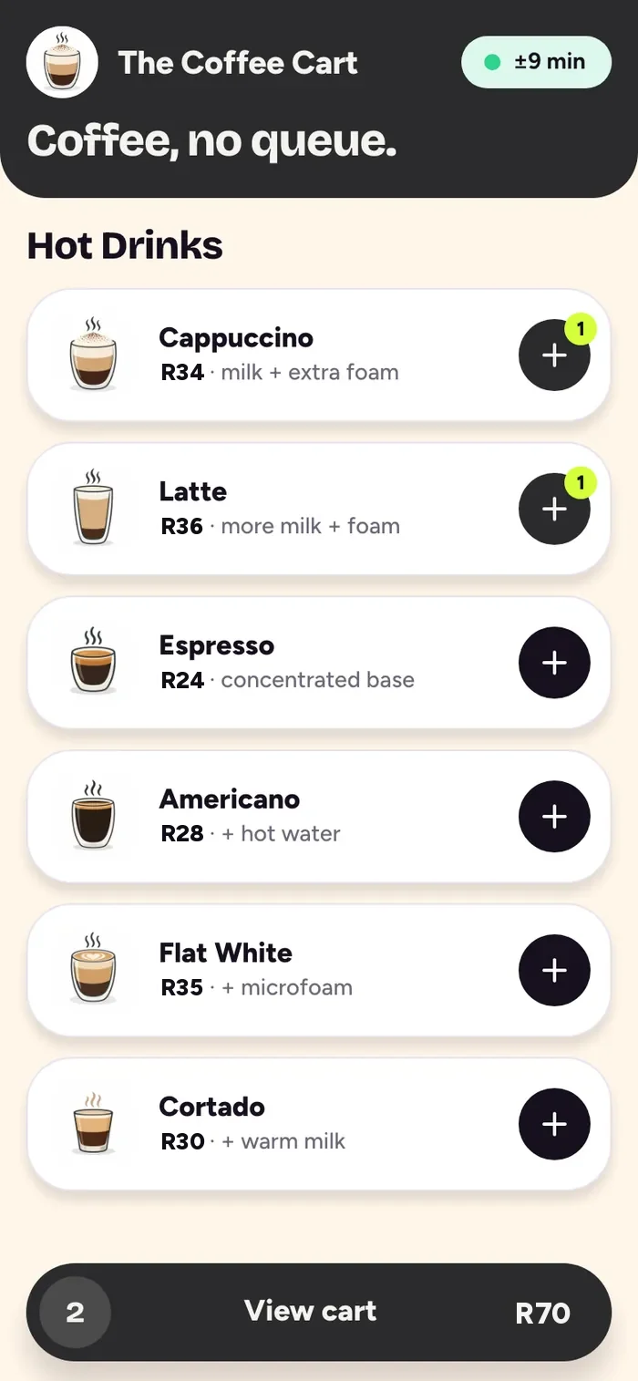
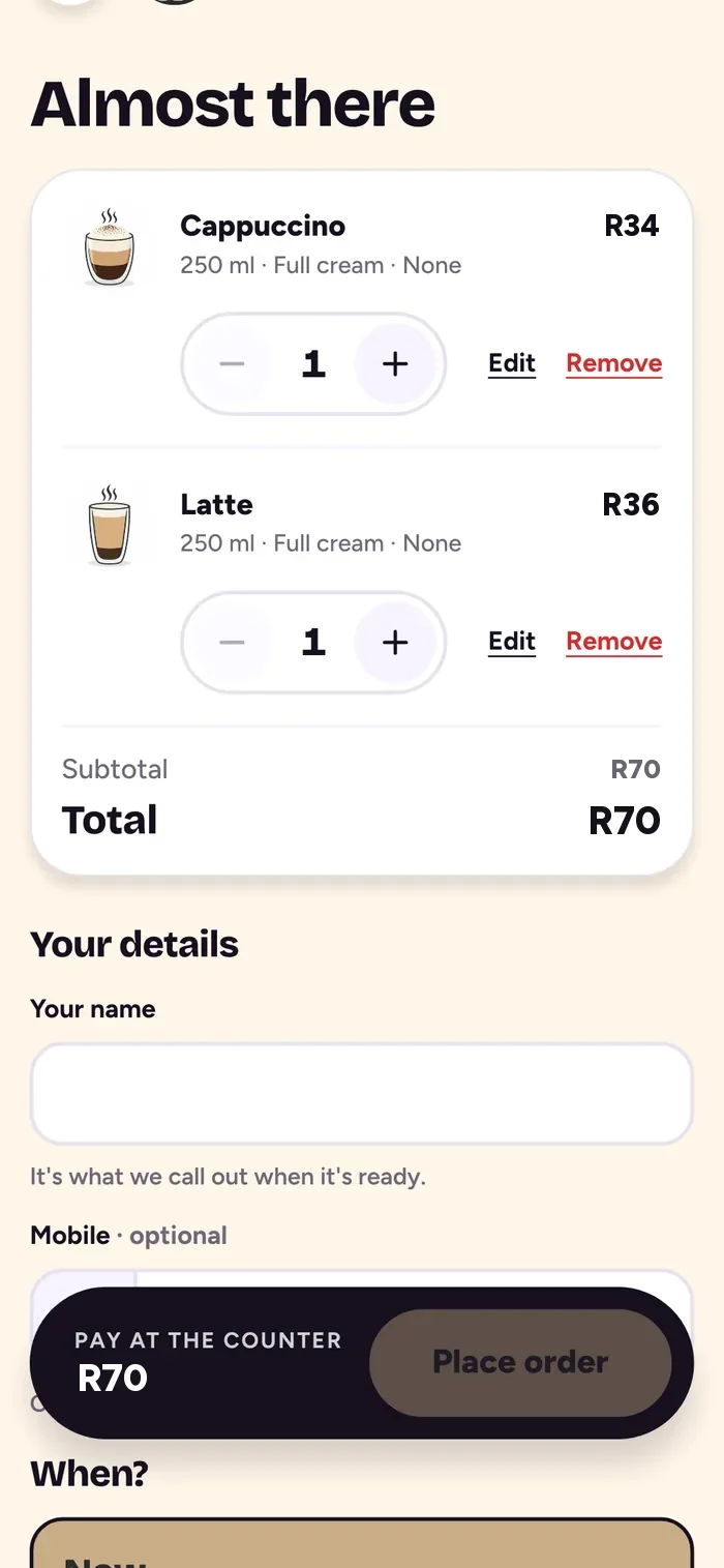
View cart. One bar: count and total.
Name, place order. Pay at the counter.
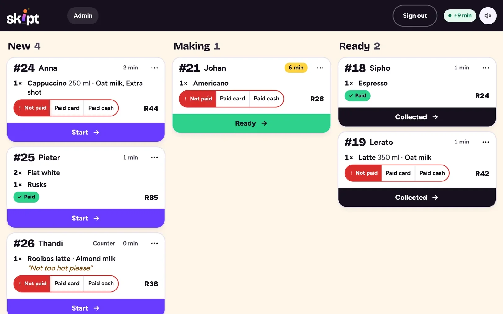
A board you can read at arm’s length.
Orders land on the vendor’s phone or tablet the moment they are placed, with a sound. Each card shows the number, the name, every option and note, whether it is paid, and one button to move it on.
A simulated board: new orders arrive in New, then move to Making, Ready and Collected.
- One word per step. Staff see New, Making, Ready, Collected. Customers see Sent, Making, Ready, Collected. One to one.
- Paid, in one tap. Paid card or Paid cash sits right on the card, not in a menu next to Cancel.
- Orders first. Three loud count tiles and a banner became one sticky bar.
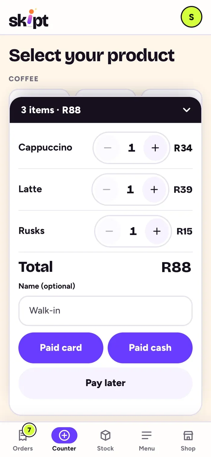
Counter. Walk-ups go on the same board.
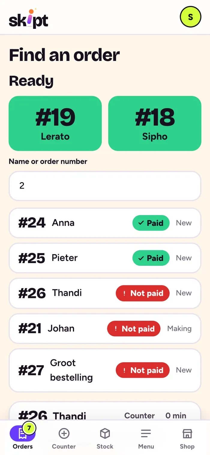
Find an order. By number or name.
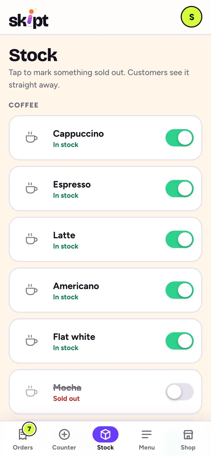
Stock. One switch, sold out everywhere.
An admin with no developer tools in the way.
Stall owners run the business between customers, on a phone. The owner side opens on what they reach for: open or pause, add minutes when it gets busy, today’s numbers in one row, and the QR code.
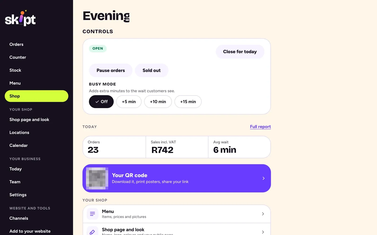
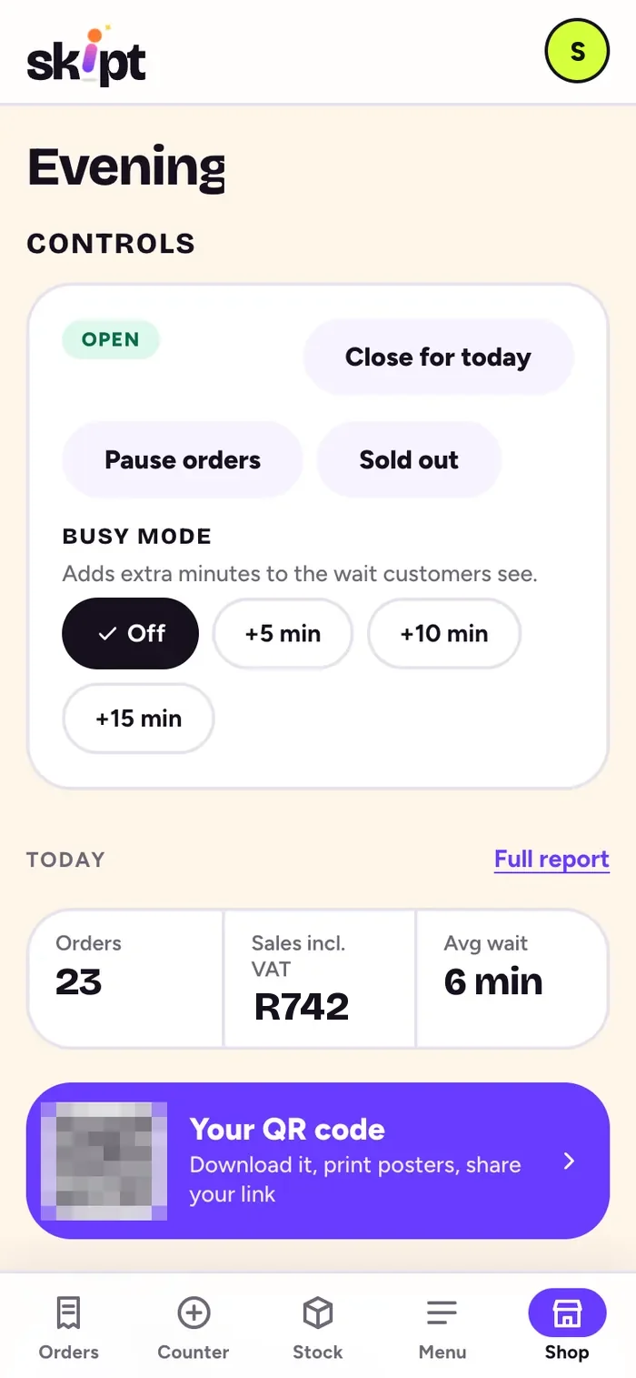
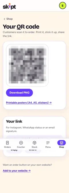
The QR page lost four screens of code.
Owners opening “Your QR code” wanted the QR. They got it, then an embed builder, snippets, colour pickers and an empty preview box. Now it is the QR, a download, posters and the link.

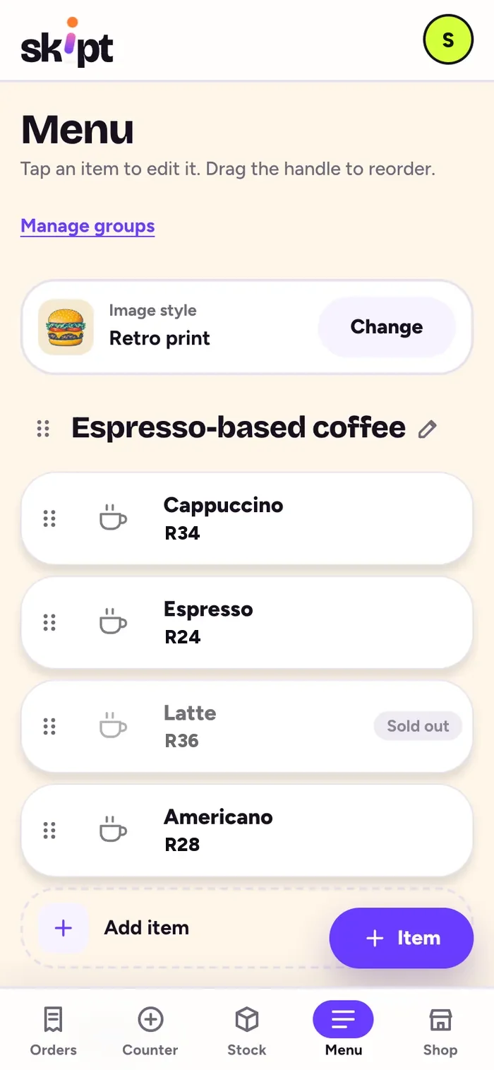
Menu. Real shop cards, dragged into order.
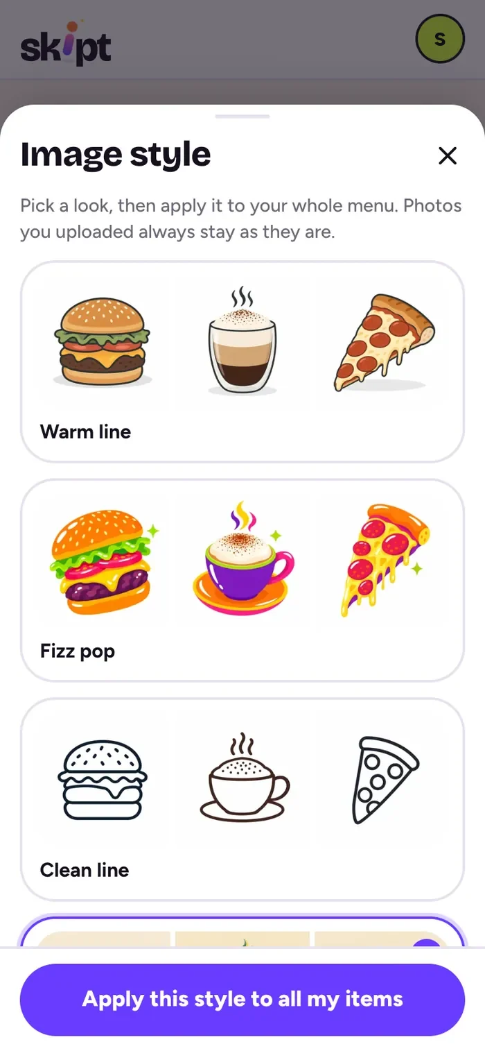
Pictures. No photos? Pick a style.
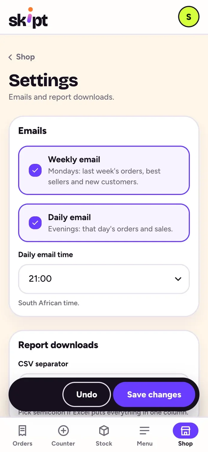
Save bar. Only when something changed.
Not the vendor’s website. On it.
- QRA code on the cartPNG or a ready A4, A5 or sticker poster. One code per spot.
- URLA shop pageskipt.co.za/their-shop, in their own logo, colours and font.
- </>One line of codeAn Order now button for WordPress, Wix, Squarespace or plain HTML.
- WPA WordPress pluginBlocks and a shortcode, set up from the WordPress admin.
<script src="https://skipt.co.za/embed.js"
data-shop="your-shop" async></script>Skipt Fizz. Loud numbers, quiet screens.
A brand that feels like a fizzy drink on a market day, held in check by strict rules so the screens stay calm enough to use in a hurry.
- Grape#6A3BFFaction
- Zap lime#D4FF3Aaccent
- Night grape#16101Ftext
- Bubblegum#FF6FB5play
Bricolage Grotesque ExtraBold for the numbers people read across a market. Figtree for everything you read and tap.
- You’re #24. We’re on it.
- Ready! Come grab it.
- Back at 10:30, hang tight.
- One loud colour per screen, two at most, on cream, white or night grape.
- Never lime text on white. Gradients on heroes, never behind words.
- Tilted tickets and sparkles on heroes, never inside a form.
- Tap targets 44px or more. A 62-piece food illustration library for menus without photos.
Strangers order. Nobody sees another shop’s till.
- Every shop is walled off. Postgres row-level security on every table, and database tests that prove one shop cannot read another’s orders.
- The server sets the price. The total a phone sends is ignored. Every item is looked up and the total recomputed, in whole cents.
- A signed ticket, not an ID. Each order gets a token signed on the server. Only its hash is stored and it expires after 24 hours.
- Only a name to call out. POPIA by design: a name, an optional mobile, anonymised after 90 days, stored in the EU.
- Prank orders
- An invisible bot check, rate limits per stall and device, a pause switch, and orders that expire after 45 minutes.
- What people touch
- One React 19 web app, installable on a phone. The admin loads only when needed so the order page stays light.
- Where it runs
- Supabase Postgres, Realtime and edge functions. The web app on Vercel. Email through Resend.
- How it is checked
- Unit tests, database tests for tenant isolation, browser tests at 390 by 844 first, and a 150 kB budget on the customer route.
One video in. Live the same day.
13/11/2026. The feedback was a 16-minute phone video, not a document. Everything below reached skipt.co.za the same day, in six pull requests.
- A 16-minute video. Customer phone on the left, staff phone on the right, every rough edge talked through.
- Transcript, frames, tickets. A frame every five seconds and eight tickets, each with a clear “done when”.
- Built, then checked by someone else. A builder agent, then a separate checker with fresh eyes. Some fixes went back.
- Live, round one. Checked on the live site at phone size.
- “Better, but still not great.” So a full audit: 39 findings, mostly things said three times. The fixes were subtraction.
- Live, round two. Four-tap order, new board, calmer admin. Before the day was out.
- English only
- No hatch QR
- Pay at the counter
- New, Making, Ready, Collected
The receipt.
No invented growth charts. These are the numbers the product is built to, and holds itself to.

Order #24 · Pay at the counter
- Taps to order
- 4
- Apps to download
- 0
- Accounts needed
- 0
- Customer JS budget
- 150 kB
- Order page on 3G
- under 2 s
- Smallest tap target
- 44 px
- Status words
- 4
- Shops on one platform
- any
Thank you. Come again.
READY!Come grab it.
Skipt is live at its first coffee stall in Stellenbosch, and the same platform is ready for the next cart, truck or market stand.
Visit skipt.co.za (opens in a new tab)